How to design a eye-catching cover.

Beauty is in the eye of the beholder and people's opinions and taste will differ from person to person. Ultimately this is your work of art and you need to be happy with the design. Where to start if often a little difficult so we have put together some great tips to help create a stunning photo book cover.  

Cover image and title.

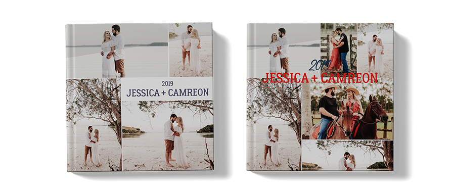
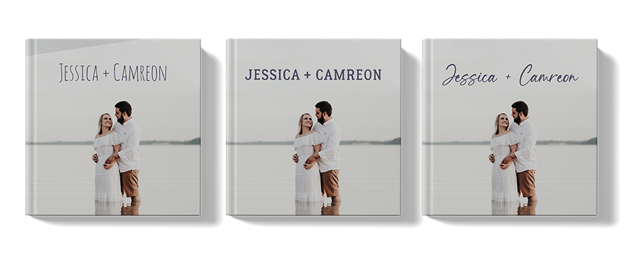
Choosing an image is an important first step for your cover design. If you want to keep it simple choose a single image with some open space on it, which will give you a natural area to add a title. If the image you have chosen has a smaller subject we suggest giving the book a larger title, paying attention to the scale and size of the various elements making up your cover. Make one of them the hero of the cover so that it draws you into the cover. Below are two examples of how the title size can be used to good effect on a cover. On the cover on the left the subject is large but the title is small providing emphasis on the people. On the right hand cover we have the opposite with a smaller subject and a large title placing emphasis on the name of the book - the eye is naturally drawn to the largest item.


Avoid Clutter.

If your book cover has too many images, typefaces and other information it just adds to the visual noise with too many elements competing for attention. You will have heard people saying less is more and this is one case where it really does apply.  Don't be afraid of using large spaces clean spaces or keeping the cover uncluttered. The nett result of a busy cover is that the eye becomes confused and doesn't know what to focus on and the impact of the cover is lost. So try to avoid too many colours in text or images. On the left we have used images with the same colour palette and the fonts are the same colour and style. You will no doubt agree that this is much better than the one on the right where there are too many clashing colours and styles.  


Choose fonts carefully.

The use of typography can make or break your book cover design so give some careful consideration to what font you choose. While colours evoke our feelings, fonts give a personality to a design. The font you choose can change the whole feeling of your photo book, however, make sure that you use only one or two typefaces to avoid cluttering of the cover. If you need some inspiration a quick google or Pinterest search should provide you with lots of ideas.